Retail Investing has become dramatically more accessible over the past decade. What once required phone calls, paperwork, and specialist knowledge can now be done from a phone in a few taps. That shift deserves credit. Apps like Trading 212, Hargreaves Lansdown, and Robinhood have opened the door to people who would never have considered investing before. But lack of understanding increases the risk.
The impact can be considerable for FS providers and life changing for the individuals who’ve made costly mistakes:
- From collapsed funds to stock market jitters, we can all recall stories of individuals who’ve lost their life savings & the huge impact this can have on themselves and their families.
- Compensation is typically a reasonable reflection of the amount of money the customer would have made or lost had they had been given suitable advice (Financial Ombudsman).
- And reputation can be hard to recover. For instance, many investors lost retirement funds by moving pensions into SIPPs without understanding the nature of high-risk, illiquid assets. SIPPs as a category have carried the reputational damage caused as a result of these ill-informed losses. This in turn could discourage many from investing in general.
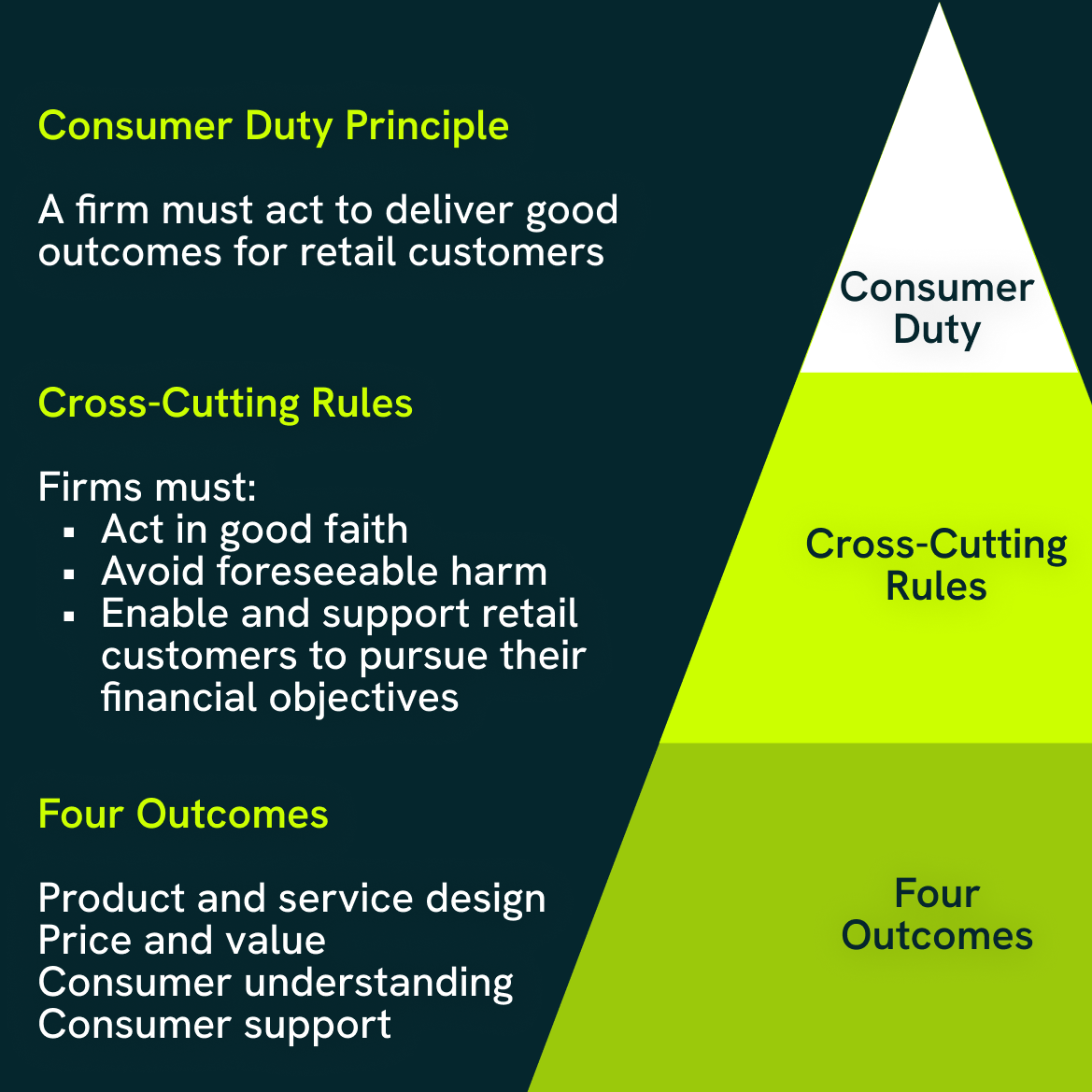
In recent years, the FCA’s Consumer Duty act has introduced a focus on providing “Good customer outcomes” by ensuring things are clear and consumers understand risk.
Access alone does not equal accessibility. Understanding matters, and for beginners in particular, many investing apps continue to assume more familiarity than they actively build.
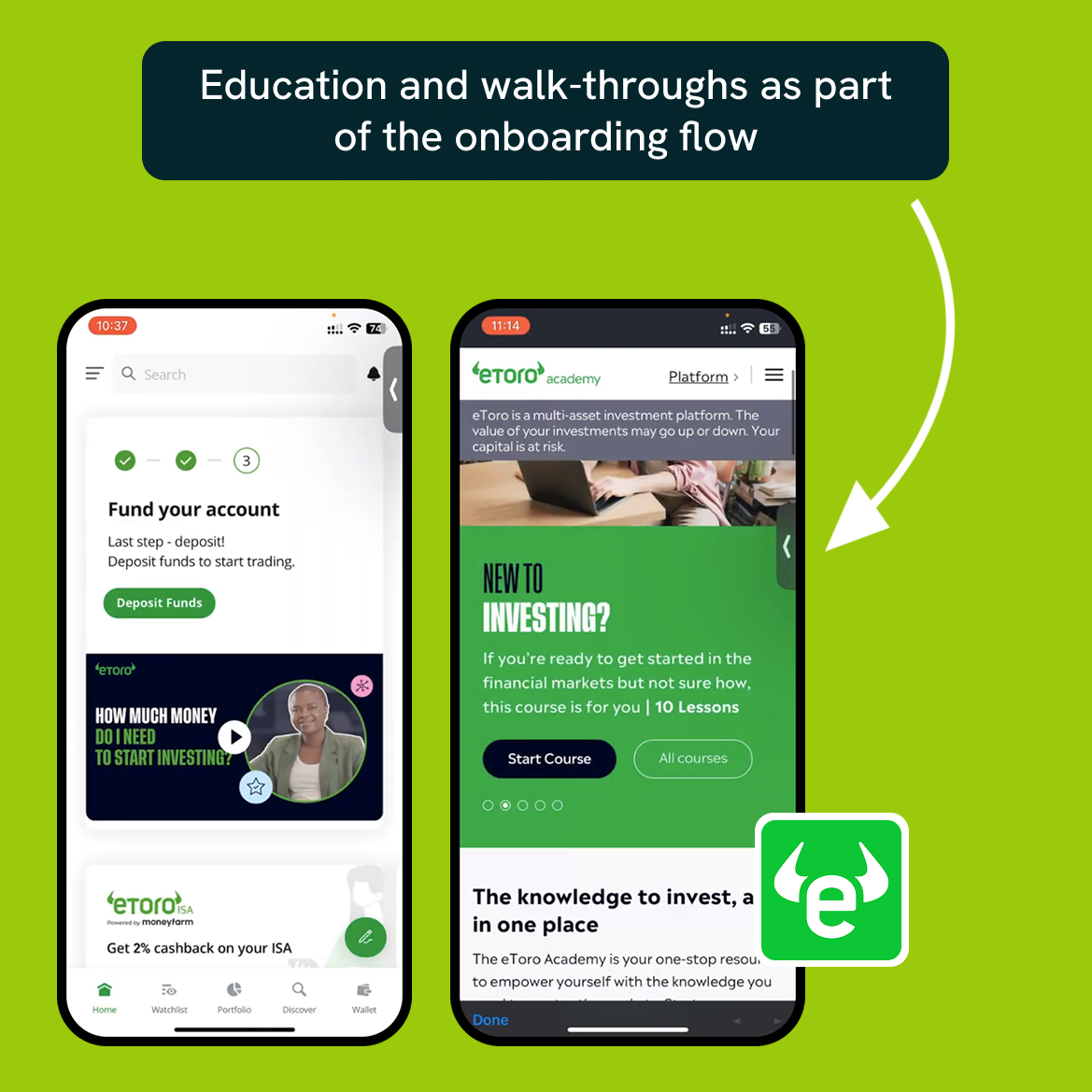
Providers such as eToro offer walk-throughs and some offer the ability to play with dummy data as part of the onboarding flow. However, education can lack context without live investments and some providers are less assistive when it comes to the real deal.
This post looks at what it’s like to move through investing apps as a beginner, following the journey from discovering an investment to placing a trade, and the design decisions that shape how understandable that journey feels.
Looking at the price
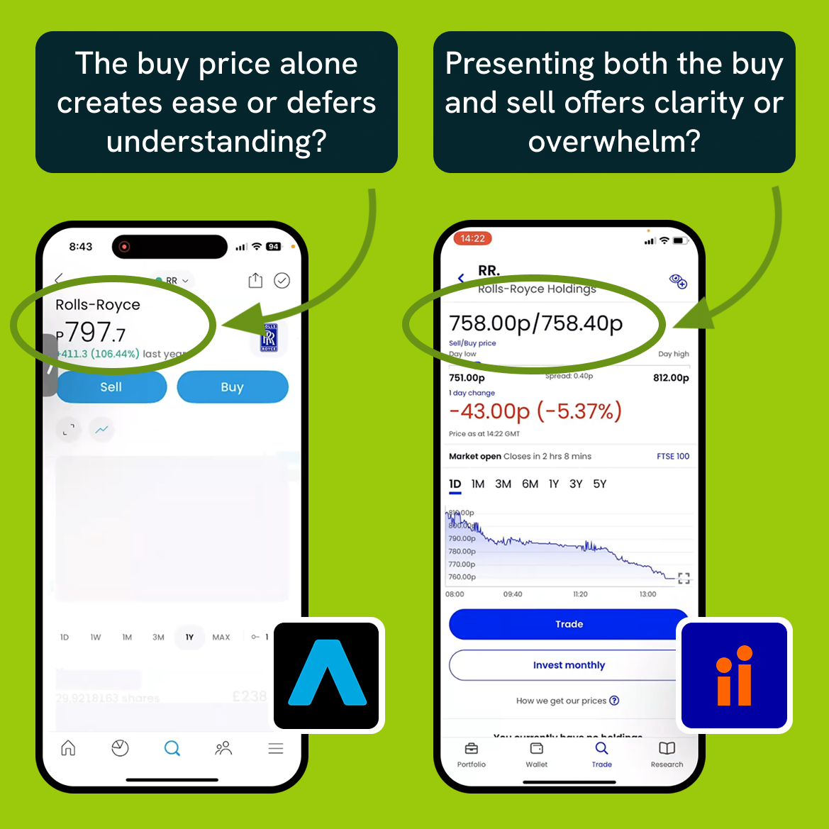
When you open a stock or fund page, price takes centre stage. Some apps make this feel calm and approachable. Others make it feel immediately dense. One of the biggest differences is whether the app shows both the buy and sell price.
Apps like Trading 212 and Freetrade typically show a single cost to buy the asset when browsing. This keeps screens calm, scannable, and low effort to process. By contrast, apps like Interactive Investor show both a buy price and a sell price upfront. This is more faithful to how markets work, but for a beginner it can feel overwhelming before you’ve even started.
Showing one price clearly reduces cognitive load. The trade-off is that it also defers understanding. When a user later buys a stock and sees their position start slightly negative, the app has not prepared them for why that happens. The spread was always there, it just was not explained.
Apps that show two prices are more transparent, but rarely explain what that transparency means. As a result, no platform quite strikes the balance between comfort and clarity.
Users are either shielded from complexity until it becomes confusing, or exposed to it without guidance.
Understanding the stats
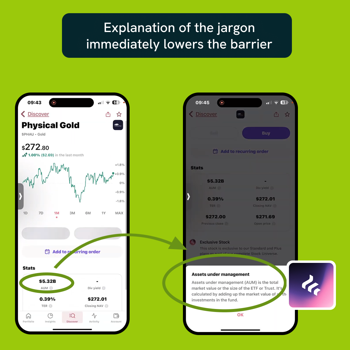
Scrolling past the price and accompanying chart, users arrive at the statistics section. This is where many apps quietly assume fluency.
Terms like P/E ratio, EPS, beta, spread, or expense ratio are common, but often appear without explanation. Some platforms, like eToro and Freetrade offer tooltips, which immediately lowers the barrier. Others simply list the figures and move on.
Individually, each unexplained term is a small hurdle. Collectively, they create friction. The interface does not say “you should already know this,” but it implies it by offering no help at the moment it matters.
Almost all of these apps have education sections. Some even include a glossary. The issue is that learning is kept separate from doing. Users are expected to dip out of the experience to look things up, sometimes repeatedly, rather than being supported inline.
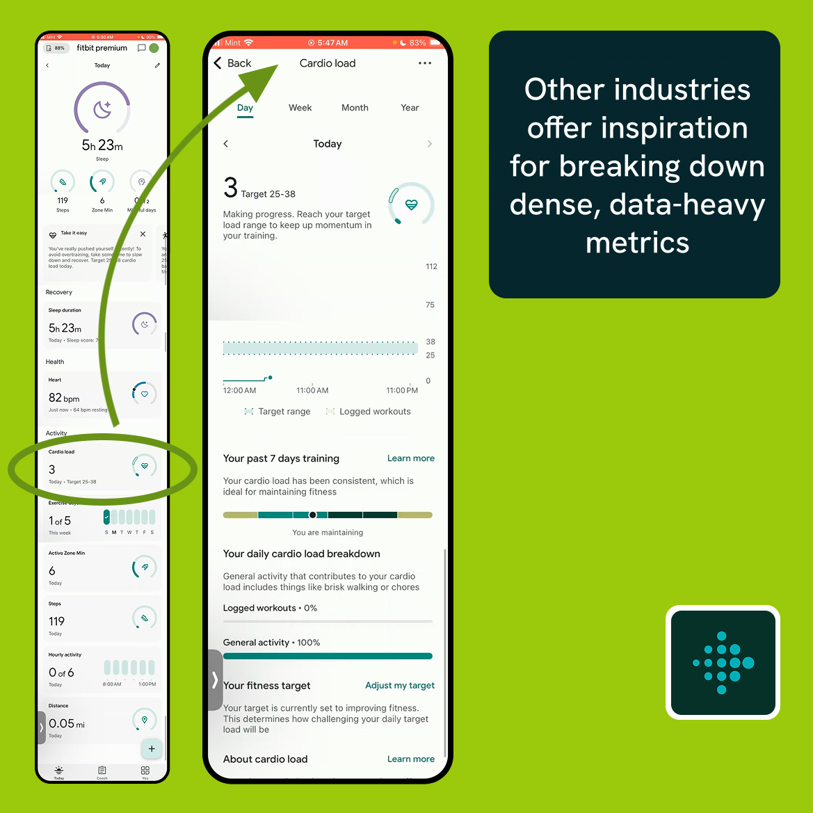
This is where other industries offer useful examples. Fitbit presents users with dense, data-heavy metrics like cardio fitness score or cardio load, numbers that mean very little on their own. But almost every one of these metrics is paired with a short explanation modal pop-up, and often a link to deeper guidance or tips on how to improve. Learning is not a separate destination, it is part of using the product.
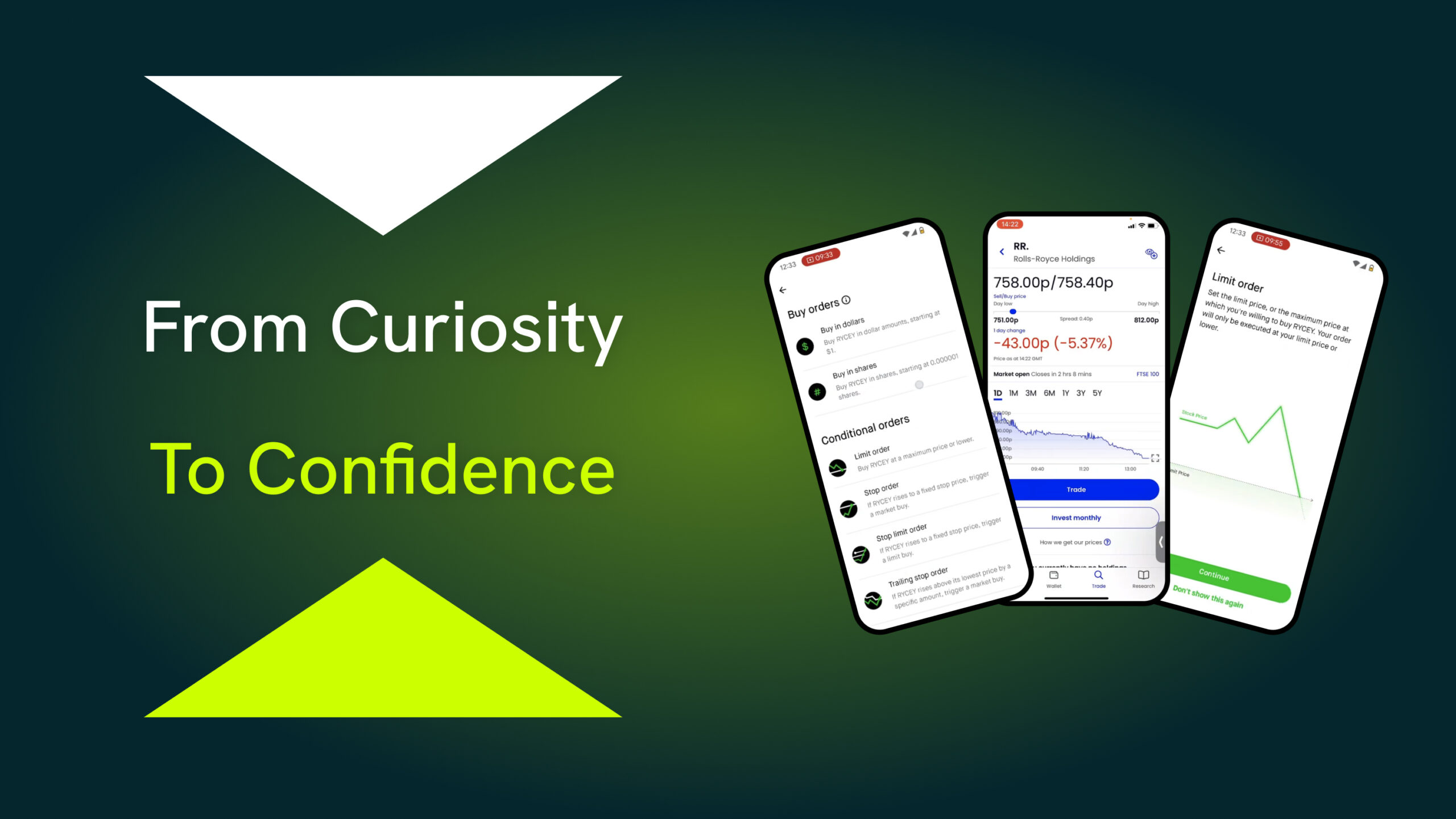
Choosing how to buy
The point at which a user decides to buy is where confidence is most fragile.
Most trading apps follow a stepped flow such as Buy, Review, Place. This structure is helpful in principle, giving users a moment to pause. But the quality of guidance inside those steps varies widely.
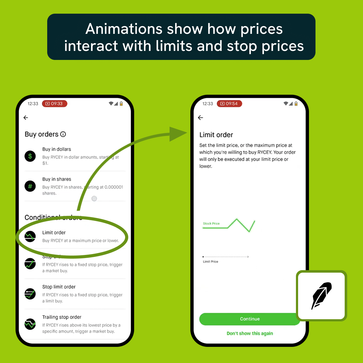
Order types are a common stumbling block. On AJ Bell, clicking Deal opens a menu listing Buy, Sell, Stop loss, and Limit order, with no explanation of what any of these mean. The assumption is clear: if you’re here, you already know.
Robinhood takes a more deliberate approach. Order type selection is a dedicated step, with short definitions and the option to view longer explanations paired with simple animations showing how prices interact with limits and stop prices. The language is not always jargon-free, but the intent to teach is clear. Crucially, users can opt out of seeing these explanations again once they feel confident.
Trading 212 embeds explanation directly into the flow by using form fields to describe what is happening. For example, “Set the maximum price you are willing to pay per share.” This makes good use of screen space, though some descriptions still rely on an understanding of what a market order is in the first place.
Across all of these examples, explanation exists, but it is inconsistent and often still written for people who already speak the language.
Warnings before you commit
Just before placing a trade, warnings tend to appear.
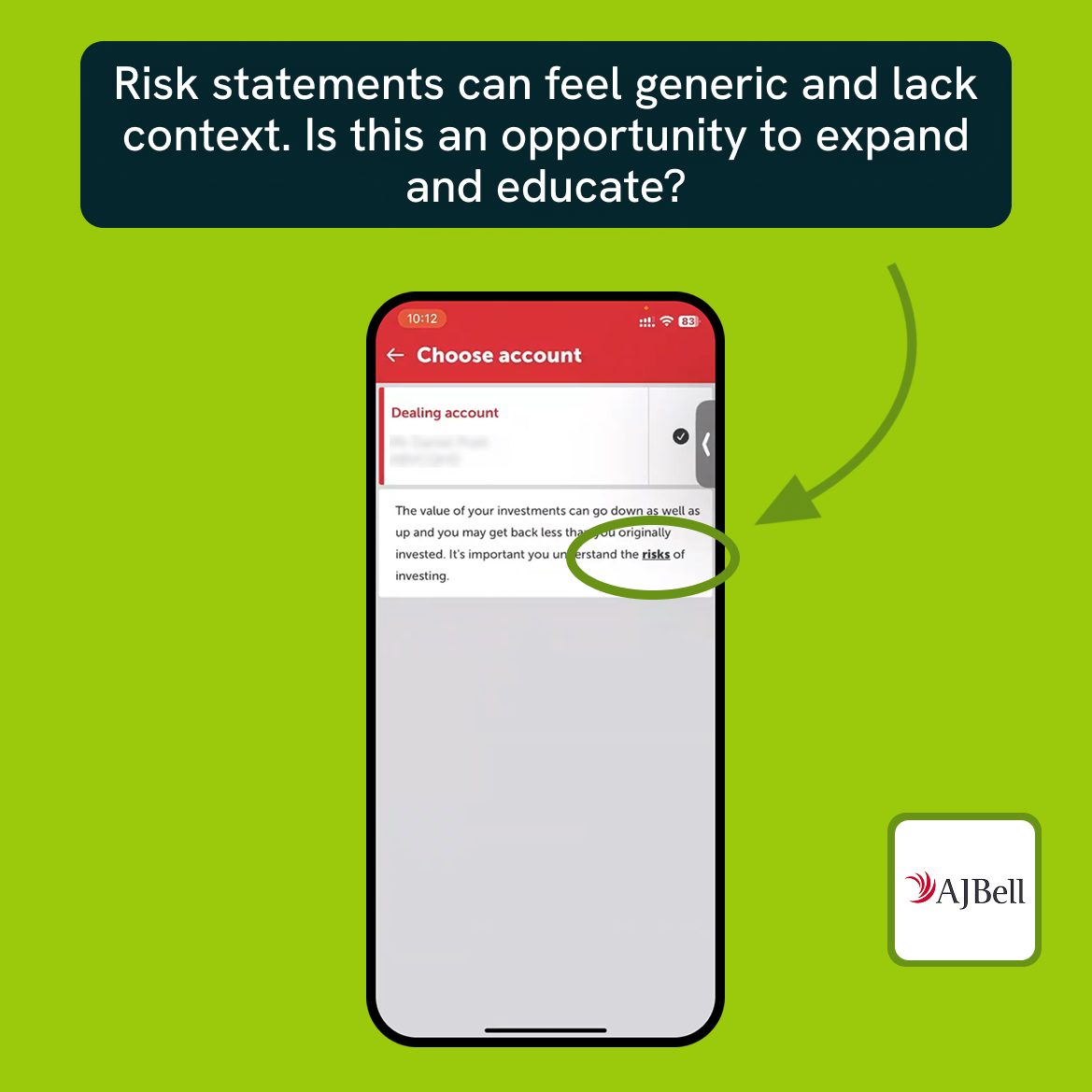
Phrases like “Your capital is at risk” or “Past performance is not indicative of future results” are common across platforms including Revolut, Freetrade and Hargreaves Lansdown. A regulatory requirement, these statements are accurate and necessary, but can also feel generic. We also see that the big players are typically more cautious and stringent with the language used.
Whilst some warn users without helping them interpret risk in the context of the decision they are about to make, AJ Bell takes things a small step further by linking the word “risks” to additional information. It’s still detached from the moment of decision, but it at least acknowledges that understanding risk is more than reading a sentence.
The result is that users are reminded that investing is risky, but not helped to understand how that risk shows up here, and what they might want to consider before proceeding.
Key insight: accessibility is more than access
Investing apps have undeniably made investing more accessible than it once was, and that matters. But many of these experiences still assume a baseline level of familiarity with markets, terminology, and conventions.
The gap is not about removing complexity. Markets are complex. Some companies are simply satisfying Consumer Duty, whilst others see this as integral to a solid user experience. The gap is about how that complexity is introduced, explained, and revisited over time.
Other high-stakes, data-heavy products have shown that it is possible to teach through use, to explain without overwhelming, and to build confidence gradually. Trading apps have made huge progress on access. The next step is designing more intentionally for the people who are still learning what all of this means.
Reducing risk through best-in-class accessibility
We’re here to help you create best-in-class, accessible experiences that are good for your customers and good for business.
BehindLogin combines competitor intelligence with UX guidance to deliver market advantage. Arrange a call to learn how we can help you with our Custom Research.
- Global insight behind the login
- Competitor journeys created with real users
- Proprietary experience benchmarking framework
For more content like this, please sign up for regular emails below.