Spotting Trouble Before You Pay: A Close Look at Starling’s New Scam Intelligence Feature
Starling has released a new security feature called Scam Intelligence, which uses image analysis to help customers spot potential scams before sending money. The feature allows users to upload an image from their photo library or take a photo of a website or listing with their phone camera, and then receive guidance on whether something looks suspicious.

Branding
The name Scam Intelligence is a strong choice. The word “scam” is common, everyday language and has a clear, Ronseal quality. Many banks favour formal terms such as “fraud prevention” or “security tools”, which can add unnecessary jargon and distance. Using the language customers already use makes the feature feel more approachable and relevant, especially in stressful situations where clarity is important.
Feature introduction email

The email that introduces Scam Intelligence is effective in some areas, but muddled in others.
On the positive side:
-
The supporting visual communicates the core idea of the feature at a glance.
-
The copy focuses on the problem being solved and clearly sets out the value of the feature for customers.
However, there are some weaknesses:
-
The example insights shown are generic. This was an opportunity to demonstrate the strongest possible insights and actions generated by the tool. For instance, instead of a vague label such as “False urgency. Must buy”, the email could have highlighted a more specific, realistic example and a clear suggested action, which is closer to what the feature actually delivers (more on this later).
-
Only the upper portion of the email describes Scam Intelligence itself. The lower section introduces a subheading titled “Scam spotting tools”, under which three other features are listed: call status indicators, 24/7 customer service and spend notifications. These features are not part of Scam Intelligence, yet they sit under a heading that feels integrated into the main feature introduction.
-
As a result, there is a risk of confusing customers. The additional features are not clearly framed as “other ways Starling keeps you safe”, and may instead be interpreted as components of Scam Intelligence.
When introducing a new feature, clarity and focus are critical. Mixing separate features under a similar heading dilutes the message and reduces clarity.
In app feature journey

Starling’s refreshed home screen UI appears modern, sharp and spacious, with good use of whitespace. You can see this, along with the full user journey, in the Figma journey map we’ve produced.
Key observations on navigation and flow:
- Within the Payments tab, Scam Intelligence is surfaced in two places. A dismissible promotional banner appears at the top, and a permanent option sits at the bottom of the function list to support discoverability.
- The button label “Analyse images for signs of a scam before you pay.” is technically correct, but the phrase “signs of scam” feels slightly awkward and uncommon. A more natural phrasing, such as “Analyse images to identify potential scams before you pay”, reads better.
-
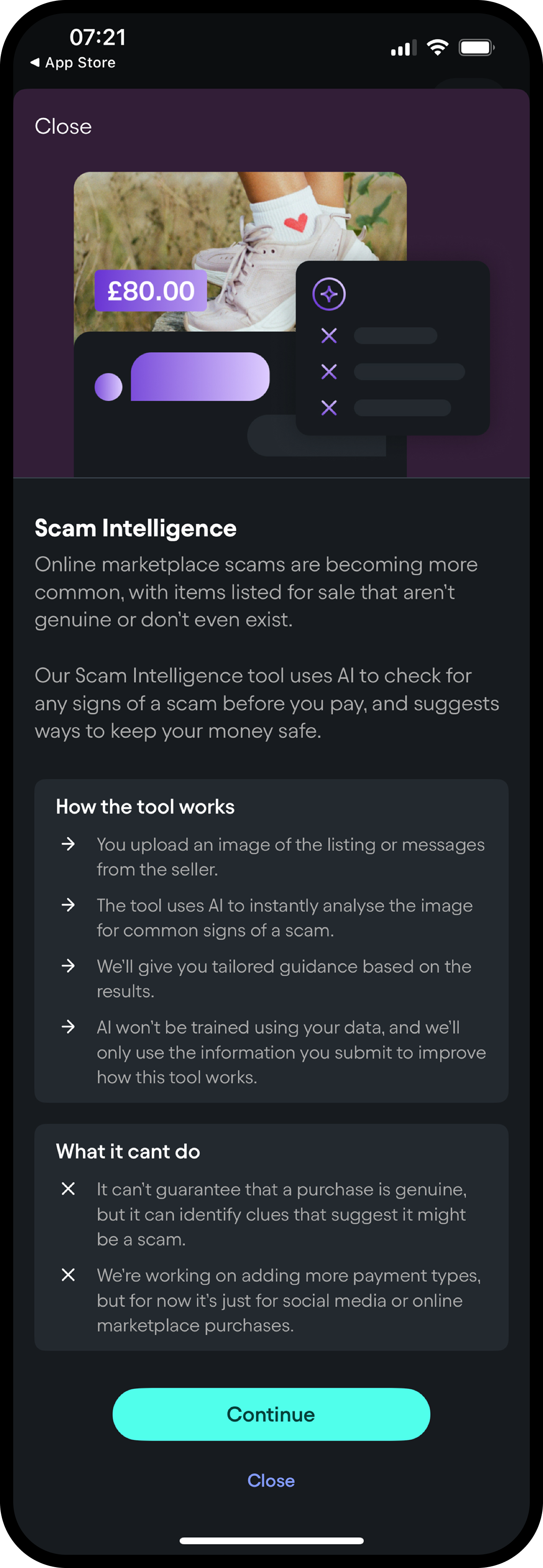
The feature’s entry screen explains what it does, how it works, which technologies are involved and what it cannot do. This level of transparency around capabilities and limitations is informative and useful from both a trust and compliance perspective.
-
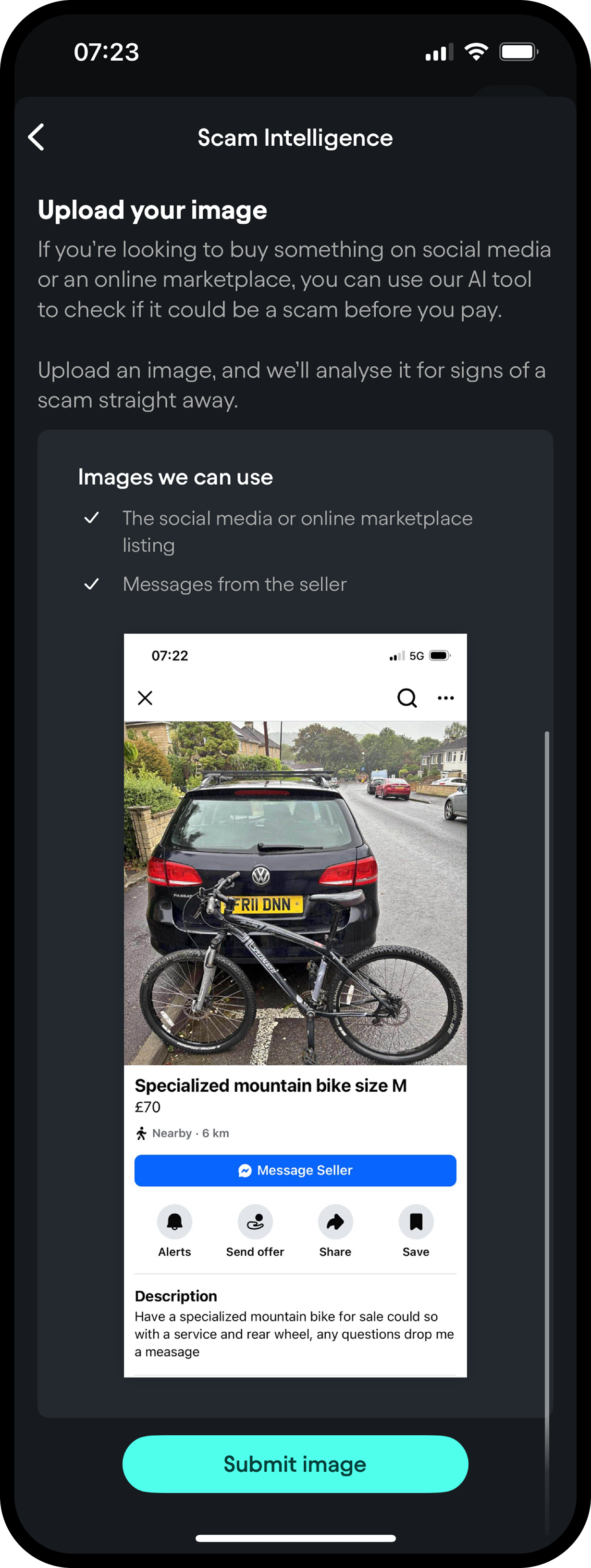
After tapping Continue, users are prompted to add an image via an action sheet offering Take Photo or Add From Library. Both options work smoothly, with clear guidance, helpful previews, and an intuitive submission flow (as shown)
-
One thing missing is the ability to paste in a product URL. Since so much shopping happens online, letting users enter a URL would be a natural addition and would nicely complement the image-upload option.
-
During processing, an interim screen informs the user that analysis is under way and provides an expected timeframe. This reassures users that work is being done in the background and sets clear expectations.
Results and insight quality

Once analysis is complete, the results are presented as a bulleted list, headed by a caution icon and a short description of the overall findings.
There are several design and content considerations at this stage:
-
Each point has an “X” icon next to it, which could make people think it’s a button to close or remove something. It also doesn’t show how serious each point is. For example, a minor concern and a major red flag look exactly the same. Using clearer warning cues, such as different icons or labels for low, medium, and high-risk issues, would help customers quickly understand which findings are most important.
-
The insights themselves are generally useful for less experienced or less confident shoppers. They prompt customers to pause and reflect, particularly when they might be making a rushed decision or shopping alone without anyone to consult.
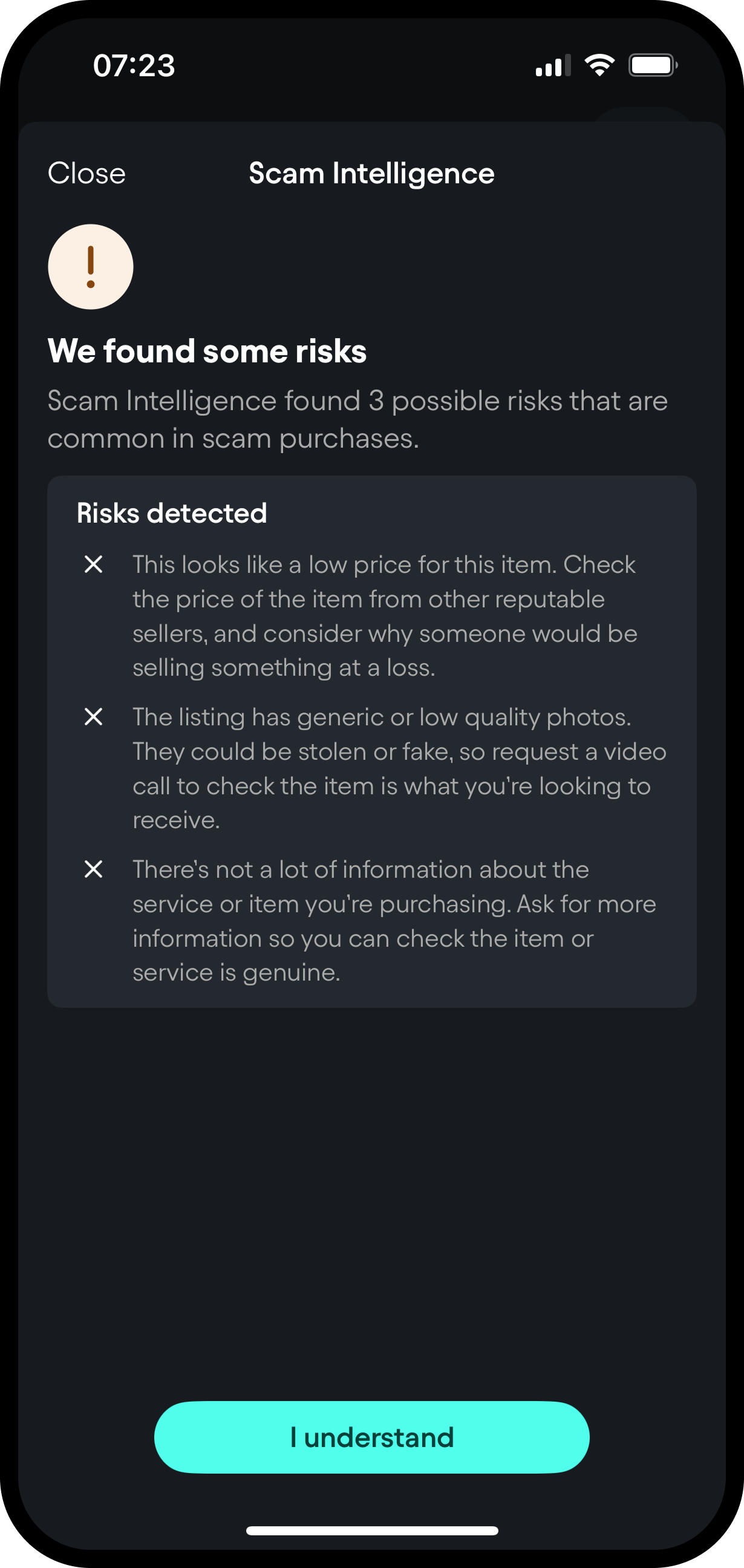
The depth and actionability of the insights, however, is mixed. For example:
“This looks like a low price for this item. Check the price of the item from other reputable sellers, and consider why someone would be selling something at a loss.”
The first sentence is strong. It highlights a specific signal that can indicate elevated risk. The second part asks the customer to “consider why someone would be selling something at a loss”, which requires a level of abstract reasoning that some customers may not be comfortable with in the moment.
More actionable guidance would focus on concrete steps, such as:
-
asking the seller how long they have owned the item.
-
asking why they are selling it at this particular time and price.
-
checking the same or similar product from known and reputable sellers.
An enhancement opportunity is to provide pre written questions that customers can copy and paste into messages to sellers. This would reduce friction and increase the likelihood that people follow the recommended checks.
Helping customers take specific actions, rather than asking them to reflect in a general or abstract way, is likely to make the feature more effective in real use and helps keep the payment journey moving.
Direction and potential
Overall, Scam Intelligence represents a promising first step in helping customers spot scams before money leaves their account. The concept is strong, the branding is clear and the journey is intuitive.
There is also clear scope for further development, including:
-
Improved iconography and severity indicators, to better communicate risk levels.
-
The addition of URL based analysis alongside images.
-
Richer and more specific insights, with a stronger focus on actionability.
- Suggested question templates and comparison prompts to assist with due diligence.
There is strong potential for this feature to evolve into a more complete decision support tool for online purchasing. Instead of only helping with payments or fraud detection, banks could also guide customers on the quality and safety of their purchase decisions. Over time, Starling could extend Scam Intelligence into a marketplace environment inside the app, allowing customers to browse, review and buy in a secure, bank-controlled setting. This would increase customer trust, strengthen protection during online shopping, and create new revenue opportunities for Starling.


