The right information at the right time turns regulation into clarity, not friction.
Designing for financial services often feels like a tug of war between regulation and usability. One side wants to protect the customer, the other wants to move them forward. In reality, both aim for the same outcome: informed, confident users who understand their decisions. The problem is not the rules themselves, but how they are delivered.
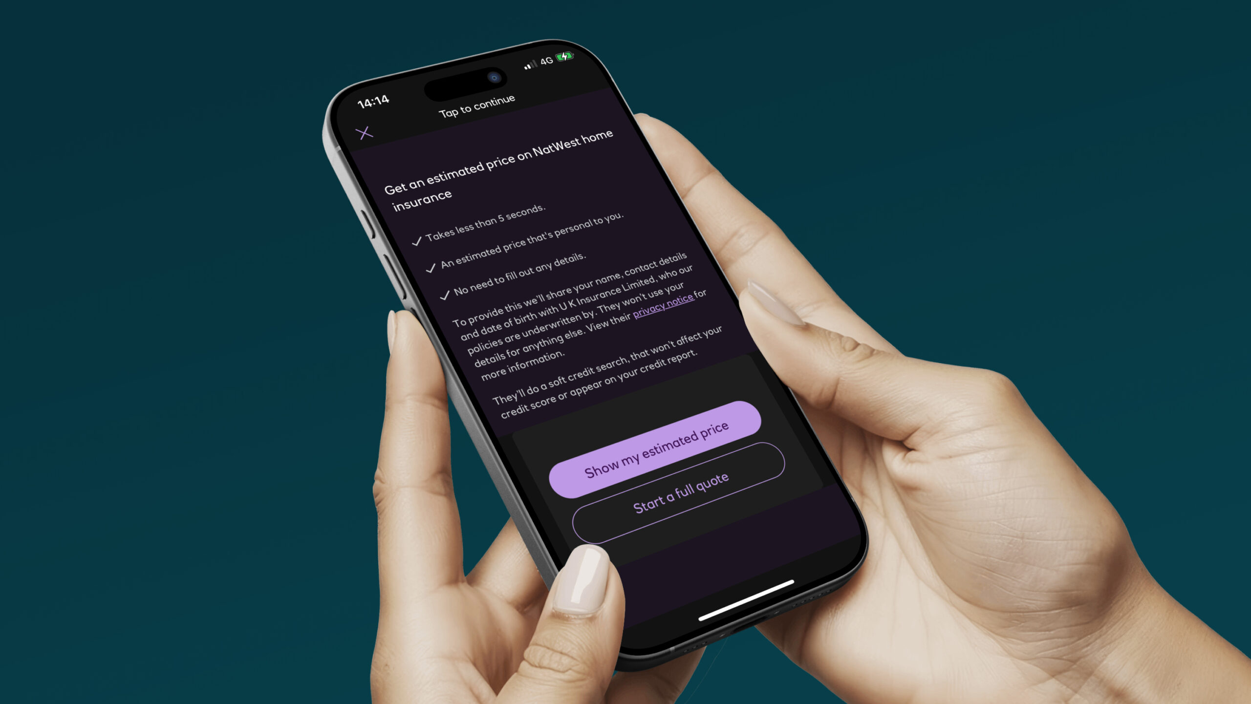
The best journeys show that compliance and clarity can coexist. They make progress effortless, language human, and detail available when needed. Every screen signals the next step without distraction. Every complex term is explained in context. Every confirmation proves understanding, not just consent. And every effort helps the customer reach the goal as quickly as possible, even if it’s an estimate, as shown above in NatWest’s insurance application.
Crafting compliant and intuitive UX is about timing and intent. Keep essential information upfront, layer deeper details below, and use design to guide focus. When the right information appears at the right time, regulation strengthens trust instead of slowing the journey.

When it goes wrong ❌
In many regulated products, good intentions create poor experiences. Legal teams front-load every caveat and assumption, product teams respond with step-by-step safety nets, and the result is a journey that feels slow, cluttered and cautious.
The fear of missing something important often leads to over-explaining everything at once, turning clear design into cognitive noise.
When this happens, the product stops feeling like guidance and starts feeling like governance. Leading to immediate bounce, unfinished applications, and frustrated users scrolling through screens instead of learning key details.
When it goes right ✅
Some teams have found a better balance – here’s how it’s done!
Each of these five examples applies the same principle: give customers what they need, when they need it, and prove understanding without overwhelming them.
Contextual clarity. Use plain English for all visible copy and communicate the “why” at the very start of the flow. Show how long the task will take, outline what’s required to complete it, and summarise the key steps (ideally three) to reduce hesitation. Break long sections of text into bite-sized chunks, and use visual design elements such as colour, images, and illustrations to separate content. Add short in-line explainers where complexity is unavoidable, and link to further reading when a topic is too detailed to cover in a sentence or two.
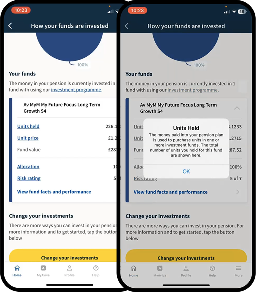
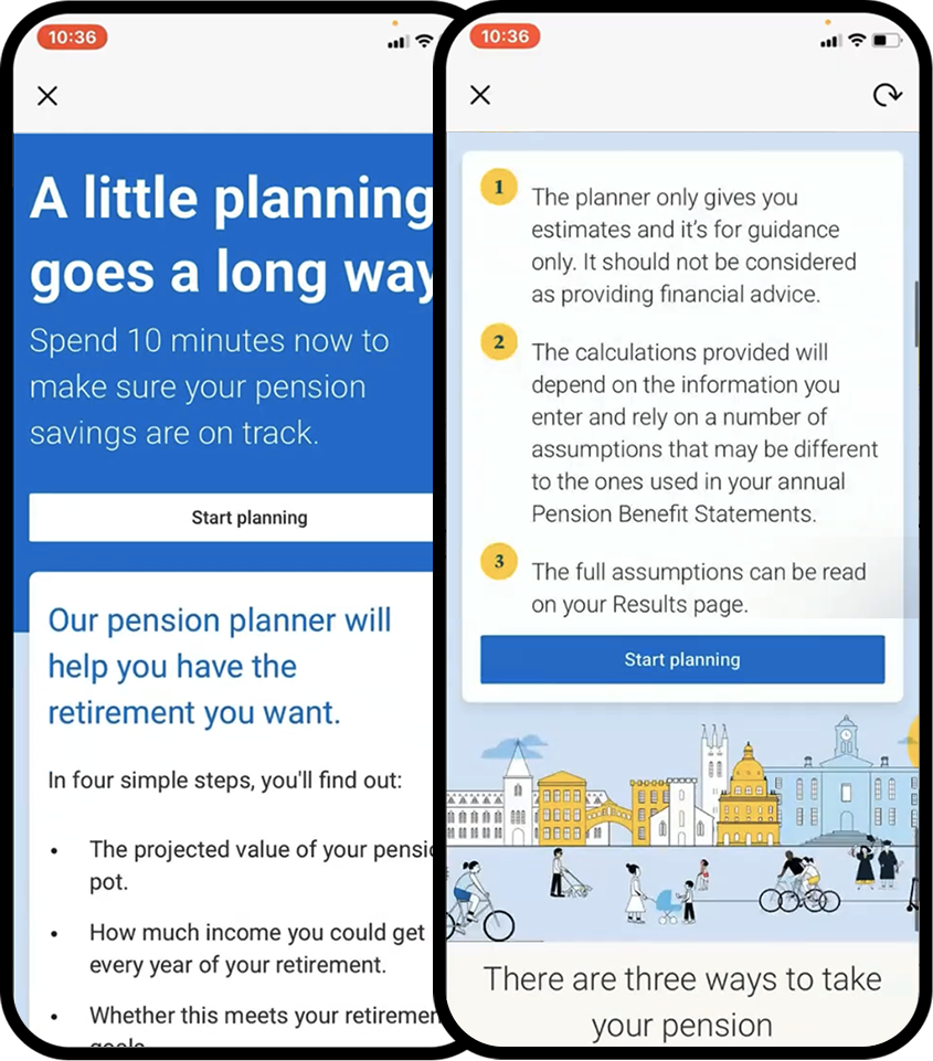
Progressive disclosure. Keep essential information visible and layer additional detail using expandable links, accordions, or tooltips. Apply this by revealing only what’s needed for the current step and allowing users to explore deeper explanations when they choose. This approach keeps users informed without overwhelming them.
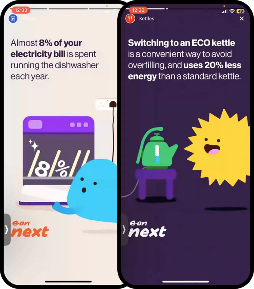
Interactive storytelling. Use full-screen, interactive spaces to teach complex topics in a simple, engaging way. Apply this by breaking information into short, visual segments that feel more like stories than static content. Incorporate animations, illustrations, or photography to bring key details to life and make them easier to digest. This approach transforms dense copy into a dynamic, memorable learning moment
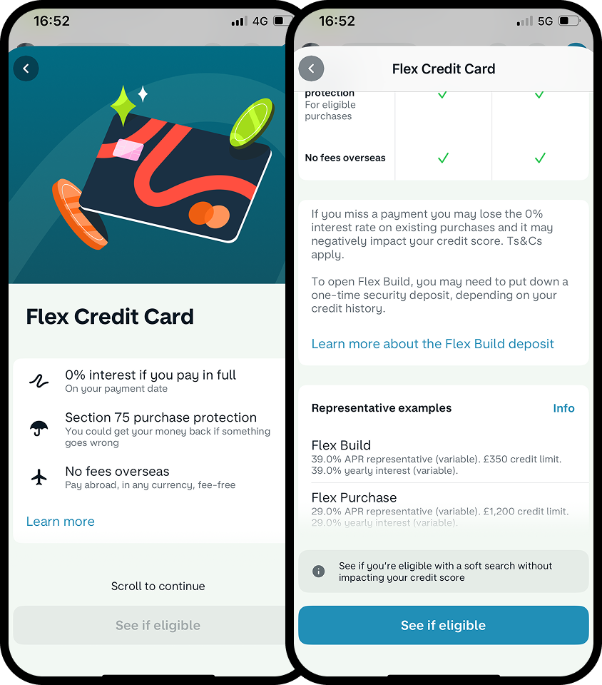
Smart confirmation design. Use interaction cues to show what’s required before continuing. A sticky, disabled button with a label such as “Scroll to continue” helps users understand how to progress. Keep content digestible by breaking it into short sections, using icons to highlight key points and charts to simplify comparisons. This approach is far more effective than long, scrollable pages of dense copy that users are likely to skip. The goal is to ensure users grasp the essentials, stay informed, and avoid mistakes before submitting.
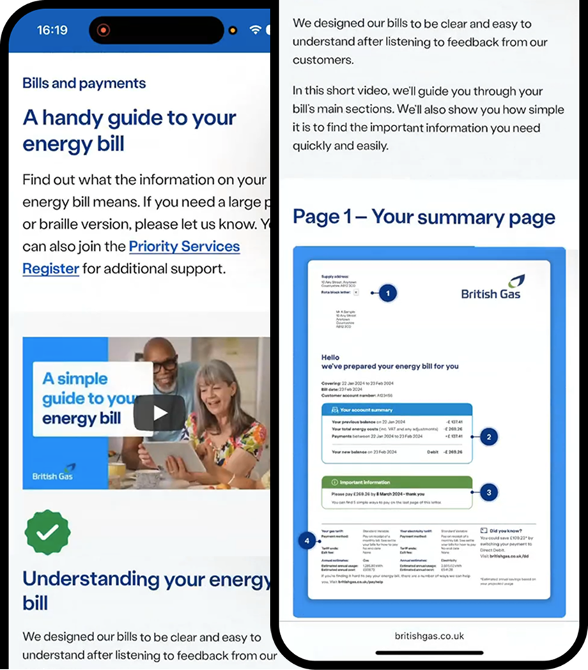
Multimedia education. Present complex topics through concise, engaging formats such as short articles, brief videos, or audio snippets. Apply this by offering multiple ways for users to consume information. People absorb information differently; some prefer reading, others respond better to visuals or audio. Catering to these learning styles ensures inclusivity and helps everyone gain a clear understanding of what’s required. This approach makes learning more effective, engaging, and memorable.
In summary
Each of these examples applies the same principle: give customers what they need, when they need it, and prove understanding without overwhelming them.
When regulation is treated as a design constraint, not a content dump, the result can be elegant and effective. Compliance does not have to clutter the journey. The right information, at the right time, makes both trust and progress possible.
Let’s do the extra work and collaborate between compliance and design to turn regulation into confidence, not confusion or disappointment for customers.