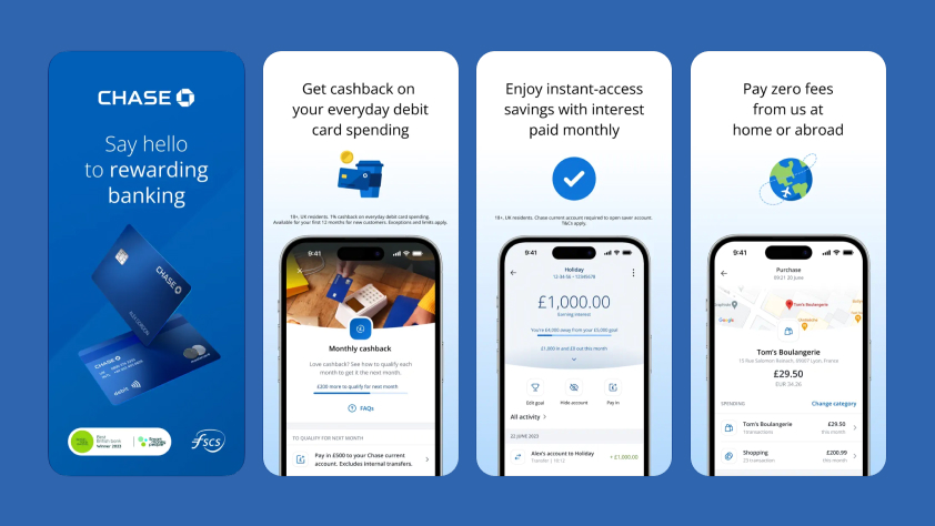
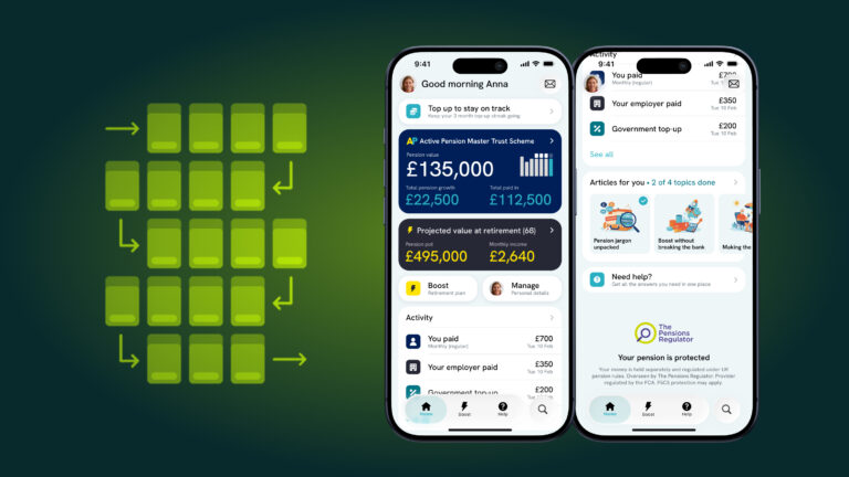
A slick onboarding journey is critical to successfully growing a user base. At BehindLogin, we’ve looked at the most common requirements for user onboarding and then explored how some of the top apps in the FinTech industry have designed these journeys for users.
Across the app landscape there is a very broad range of sign up experiences and onboarding solutions all executed with varying levels of success. So far we have analysed the Revolut onboarding journey and now we’re looking at another market player, Chase.
Chase, owned by industry heavyweight JPMorgan Chase & Co, landed on the digital banking scene in early 2021 with a mobile-first banking app, attractive interest rates and a big cheque book for future development.
JPMorgan Chase & Co have committed to $12 billion of tech investment over the next 10 years to take the Chase app and other technology initiatives forward.
In this blog post we have reviewed the Chase onboarding journey, check out the video below.
Chase – App Onboarding
Total time to setup account: 09:46 (video edited to remove delays and user error)
Total screens: 35
The journey map can be found and screenshots downloaded on our Miro board.
Key Takeaways

As a general overview, the onboarding experience is good. Each screen is clear and simple with what is required from the user and the consistent flow gives users a nice sense of progression.
The Chase app also effectively uses pre-populated data fields from the device such as name, phone number, email, postcode etc. to reduce user input & friction.
The Chase onboarding journey has a total of 35 screens, compared to only 10 on Revolut. This is clearly quite a big difference but can be explained as Chase offer a Current account (which requires more user information to open) than a simple pre-paid cash account like Revolut. Chase could potentially look to offer a pre-paid cash account service to streamline onboarding and user conversion and then promote Current Accounts when users are engaged and committed to using the Chase app.
The Chase app includes a number of user interactions and features which could be better positioned after account creation to streamline onboarding. This includes adding Apple Pay, setting a card PIN & opening a Saver account. Moving these items and prompting users from within the app home screen would give the sense of completion earlier in the journey and potentially reduce drop-off.
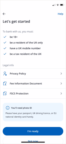
Due to the length of the journey it might be valuable to show a progress tracker to give users an indication of remaining time / effort required to complete the journey. There is also no obvious way to pause or return to an application which may create confusion and drop off if users don’t have ID or are interrupted for any reason. This has been mitigated somewhat by the opening screen which shows a user what they will need to open an account but is still likely to cause issues if users do not have the required documents to hand (pictured right).
Overall, Chase does a good job at onboarding users, but there are some improvements that can be made to streamline the journey.
As Behind Login continue to conduct competitor and market research we will provide comparisons, recommendation and insights to help our readers and clients build exceptional digital experiences for users.
Get in touch if you want to stay ahead of the evolving competitive landscape. Book a call with our team.
